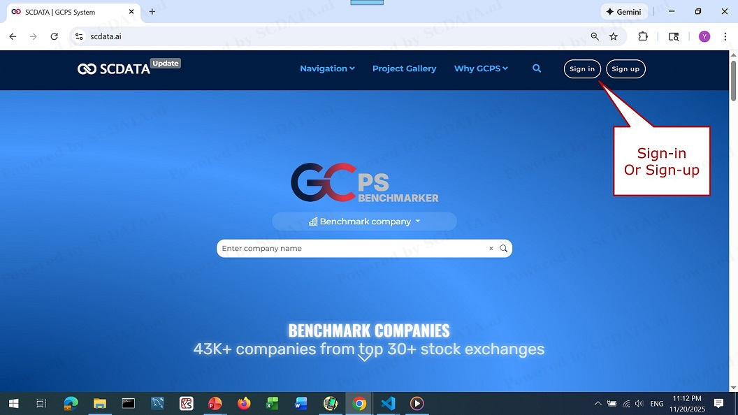
Sign-in or Sign-up

4
GCPS is web-based and you can sign in or sign up here.
4/39
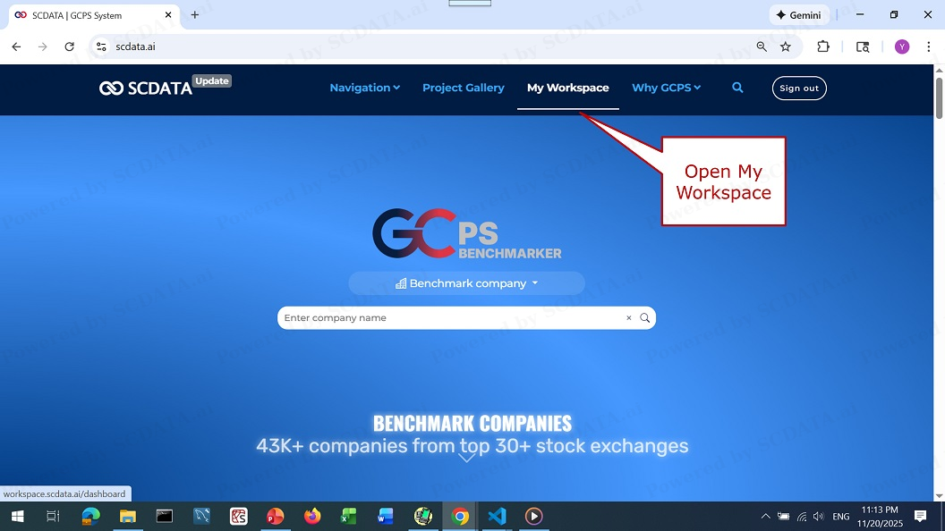
Open workspace

5
Once signed in, you can open your workspace here.
5/39
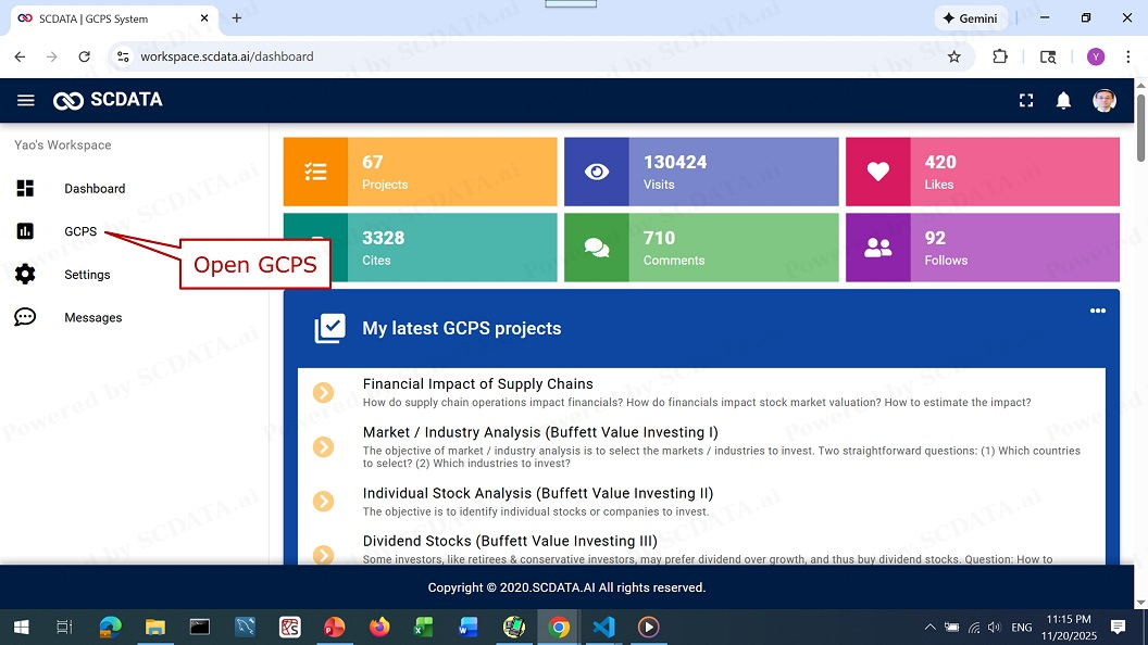
Workspace dashboard

6
In your workspace, you will first see your dashboard which summarizes your activities, such as, your current projects and your interactions with other users, for example, likes, cites or copies, comments. If you want to create some analysis, please click on GCPS.
6/39
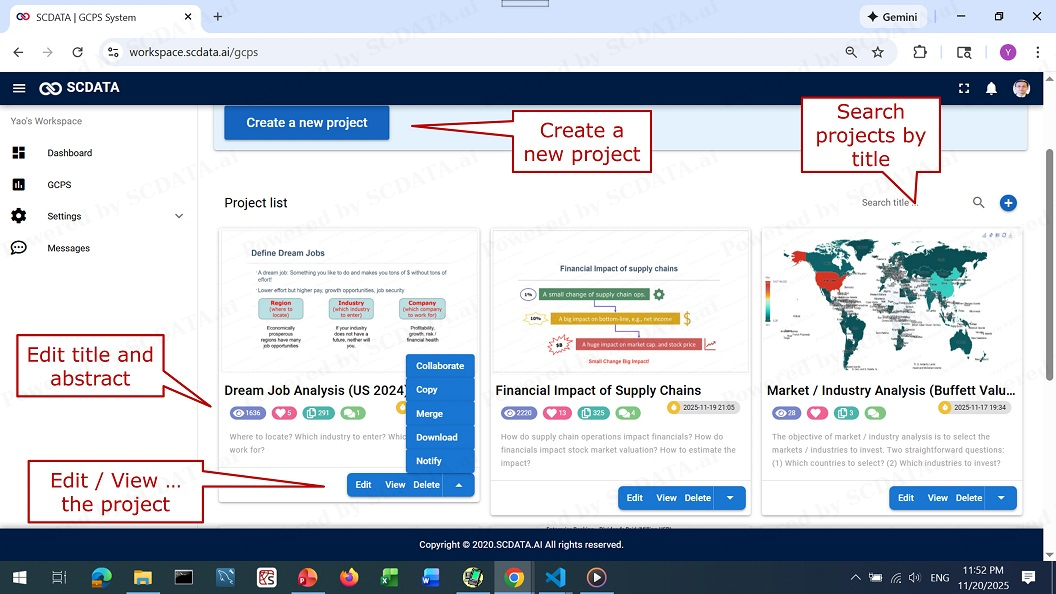
GCPS interface

7
In GCPS, you can create a new project and search for existing projects by title. You can edit the title and abstract of a project. You can also edit the content of a project, slide-show / preview the project, and delete the project. Finally, you can invite other users to collaborate on a project, copy a project, merge multiple projects into one, download a project into PDF file, and notify your followers of this project.
7/39
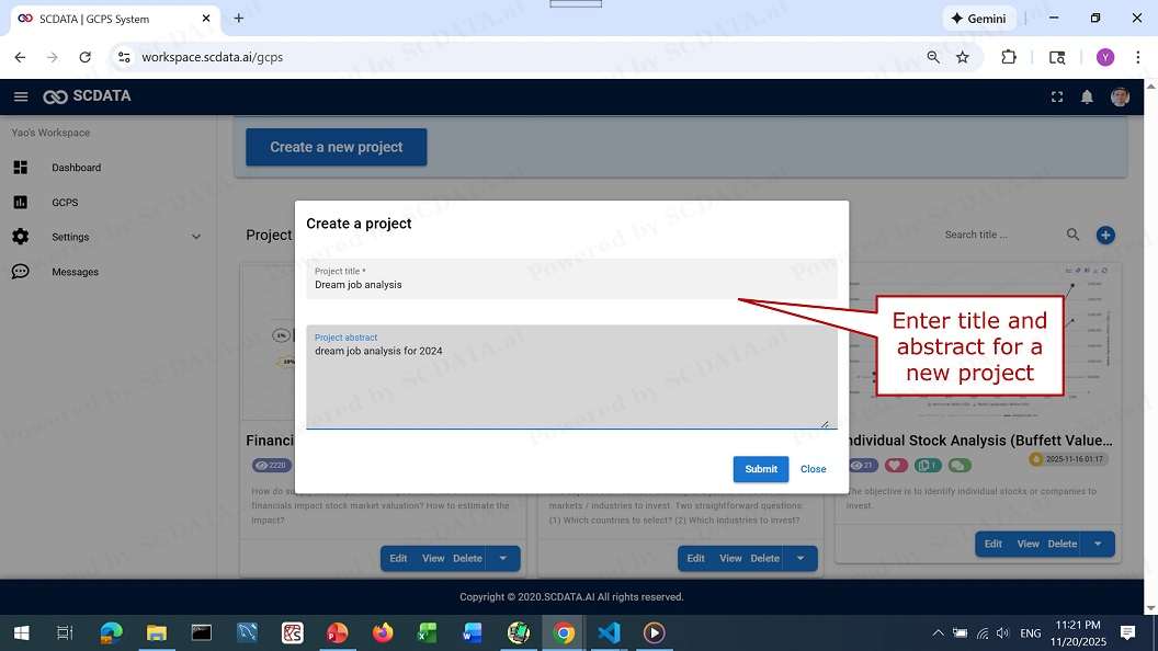
Create a new project

8
To create a new project, please enter a project title and abstract here.
8/39
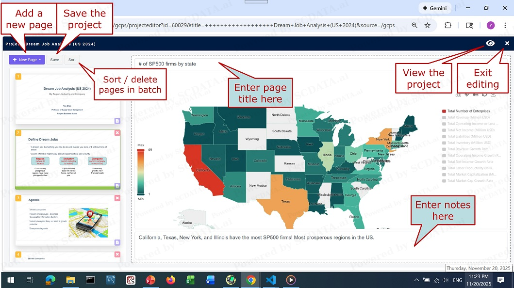
Edit a project

9
When you edit a project, you can add a new page, save the project, preview the project, and sort or batch delete pages. On each page, you can add the title of the page here, and enter your notes / insights etc. here. Once you are done, you can exit the project here.
9/39
Create new page

10
You can create a new page by clicking on “New Page”. In the drop-down menu, you can choose from the following options: template page, analysis tools, navigator, SC mapping and upload image. Let me explain each option one-by-one.
10/39
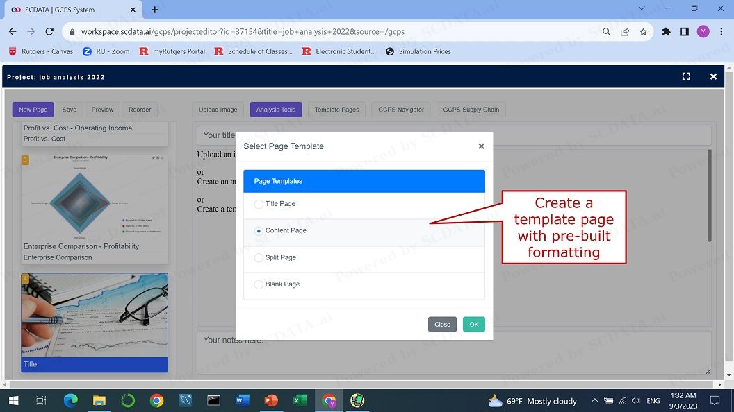
Template pages

11
It will be much easier for people to understand and appreciate your work if you can include some template pages into your project to summarize your findings and insights. There are four types of template page to choose from, such as the title page, the content page and the split page, and blank page.
11/39
Edit a template page
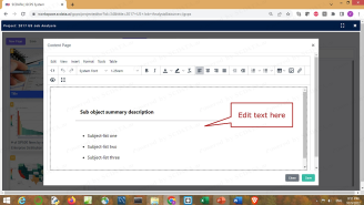
12
Here is an example of the content page. Feel free to edit the text here.
12/39
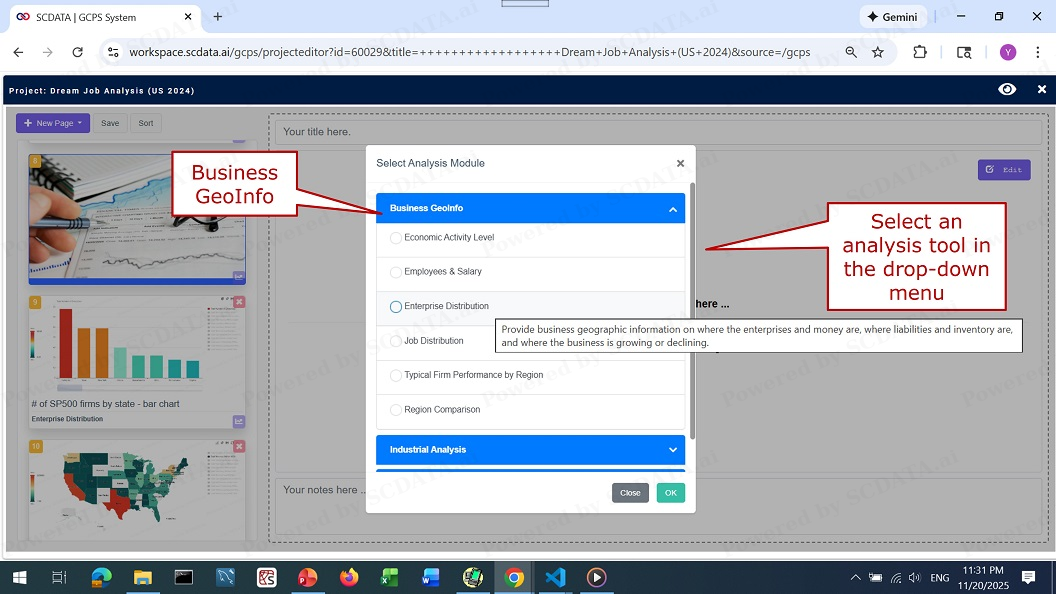
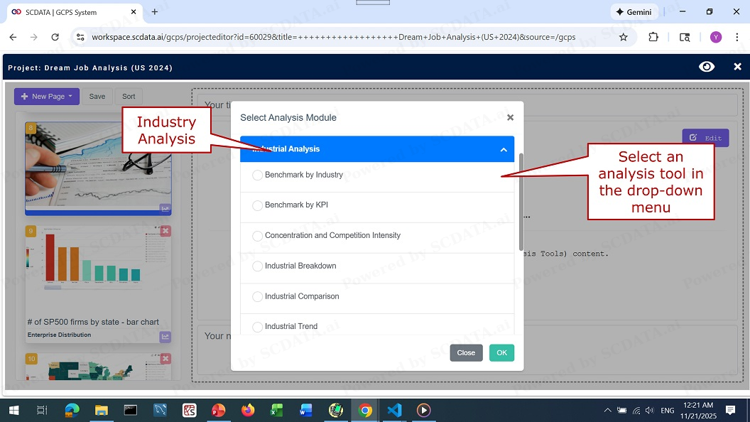
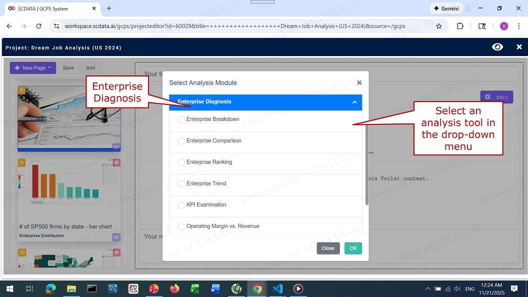
Analysis Tools

13
Clicking on Analysis Tools button brings up a drop-down menu where you can select a variety of analysis tools, such as business geoinfo, which projects company data to maps; industry analysis, to analyze and compare industries; and enterprise diagnosis, to compare and benchmark companies. Let’s first create an analysis for business geoinfo, which includes enterprise distribution and region comparison among others.
13/39
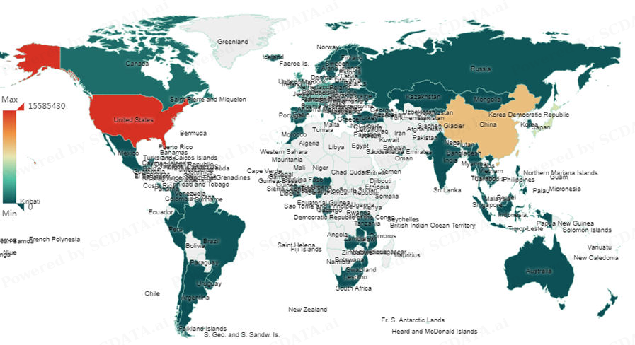
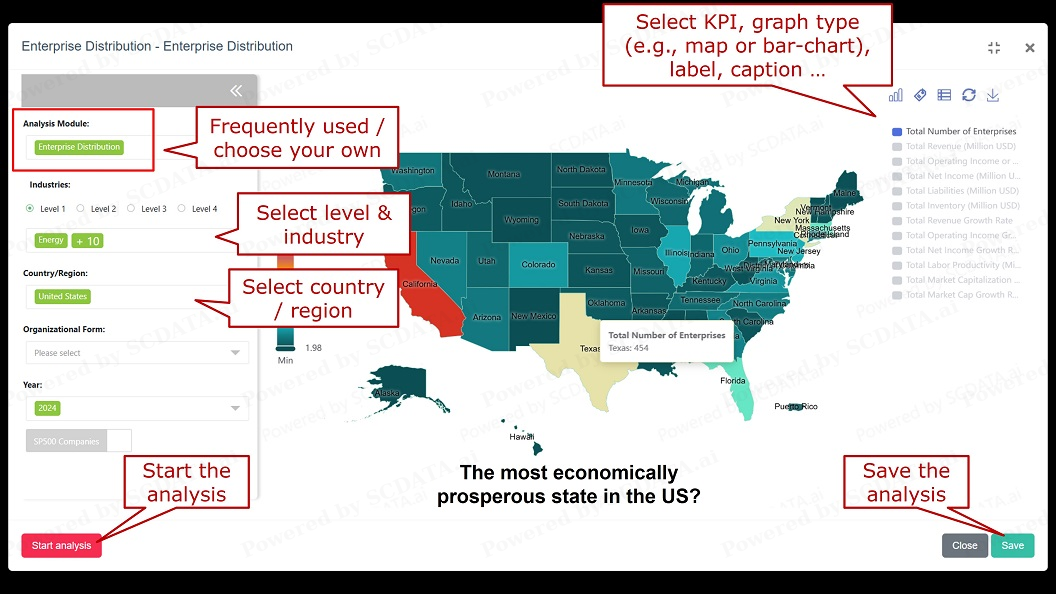
Enterprise distribution

14
Let’s first open the map tool of enterprise distribution. On the left panel, you can select analysis module, industry, country / region, organizational form and year. Analysis module has two options: (1) “Enterprise Distribution” includes KPIs often used, (2) you can choose your own KPIs (profitability, growth, health, efficiency, valuation) to show on the map. When you select industry, pay attention to the levels: the higher the level #, the more granular the industry classification is. After selecting the level, you can search for industries. Next you can select region / country: ~100, search. Finally year. Then, click on start analysis, a map is now generated. On the right panel, you can select which KPI to show on the map. On the top of the right panel, you can change graph type from map to bar-chart, show or hide label and caption, and download picture. Finally, you can save your analysis here.
14/39
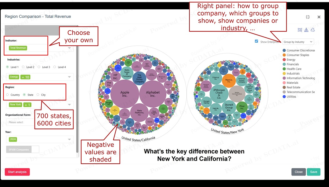
Region comparison

15
Let’s open the map tool of region comparison, for instance, to compare two states of the US: New York and California. Left panel: you choose the KPI or indicator (from 5 categories), region (country, state, city). Right panel: group companies, select groups to show, show companies or just the industry. Please note that in the picture, negative values are represented by shaded circles.
15/39
Industry analysis tools

16
Industry analysis tools are designed to study and compare different industries, they include benchmark by industry / KPI, concentration and competition intensity, industrial breakdown, comparison and trend, and KPI distribution by industry, among others.
16/39
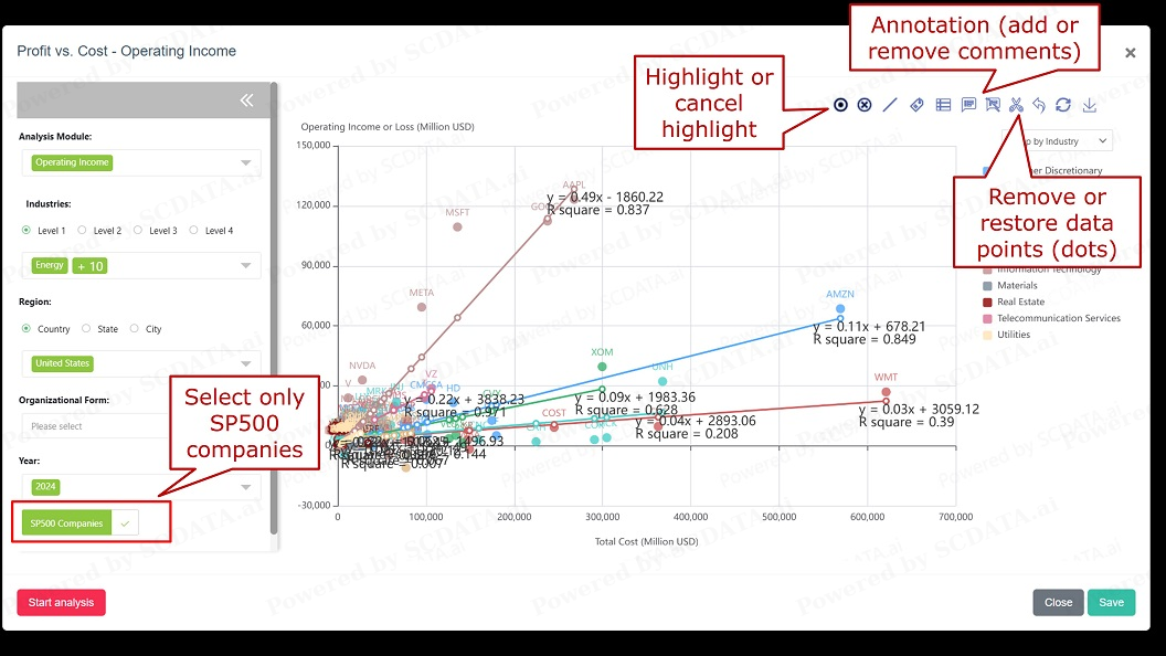
Profit vs. cost

17
In scatter plots of profit vs. cost, for instance, there are additional features such as annotation, dots removal / restore, dots highlight. Annotation allows you to add or remove comments / notes on the graph. Outliers may skew a graph, so dots removal can help you get a better understanding of the data. Dots highlight allows you to search and highlight companies on the graph. This is useful because sometimes there are too many companies and you cannot find the one that you are interested. The SP500 companies button allows you to focus only on SP500 companies.
17/39
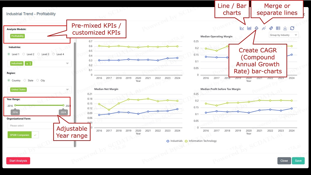
Trend Analysis

18
Inside trend analysis: on the Left panel, you can select analysis module to be different KPI combinations, either pre-mixed / frequently used KPIs or choose your own / customized KPIs, either total or median. Year range can be adjusted. On the Right panel: Merge or separate graphs, switch between line or Bar charts, calculate and plot CAGR bar-charts. CAGR = compound annual growth rate.
18/39
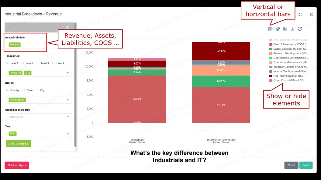
Breakdown analysis

19
Inside Breakdown analysis: on the Left panel: analysis module represents different breakdowns, most popular: revenue, assets, … Right panel: vertical or horizontal bars, show or hide elements.
19/39
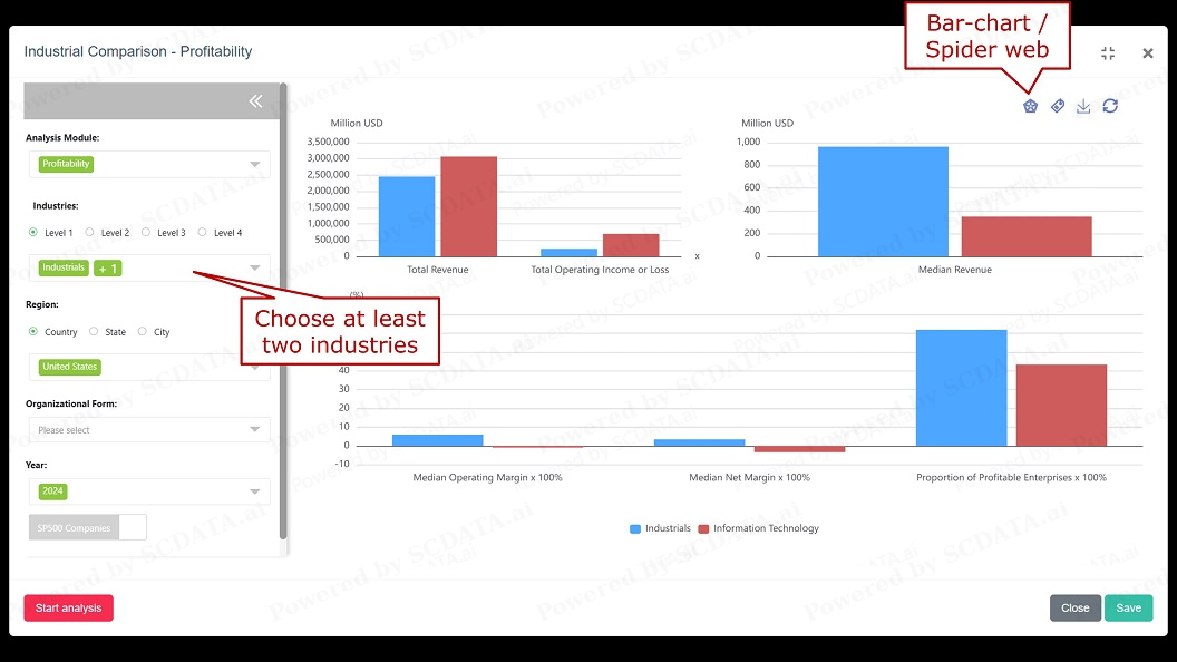
Industry comparison

20
Left panel: choose at least two industries to compare.
Right panel: switch between bar-charts and spider web
20/39
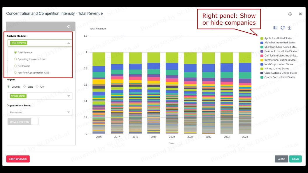
Concentration and competition intensity

21
On the Left panel: use analysis module to select different metrics, such as total revenue for market-share analysis, profits for the split of profit, or four-firm concentration ratio ~ the market share of the four largest companies in this industry.
Right panel: show or hide companies.
21/39
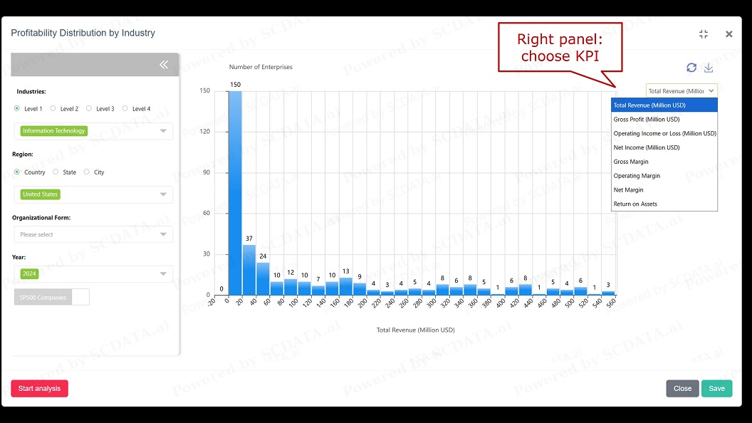
Histogram or distribution study

22
KPI distribution by industry shows how the KPI is distributed for the selected industries, regions and year, it’s the Histogram of the KPI. Right panel: choose KPI. Use mouse to zoom in to see more details.
22/39
Enterprise Diagnosis Tools

23
Enterprise diagnosis tools are designed to compare individual companies and diagnose their problems and causes, they include enterprise breakdown, comparison, ranking and trend, as well as value driver analysis, among others.
23/39
Auto fill

24
Auto fill provides a quick way to get you the companies you want. This is especially useful if you don’t know the industry classification of the companies that you are looking for. You can use auto-fill to search companies, such as Apple and MSFT, which automatically fills in parameters, such as industry, country, on the left panel.
24/39
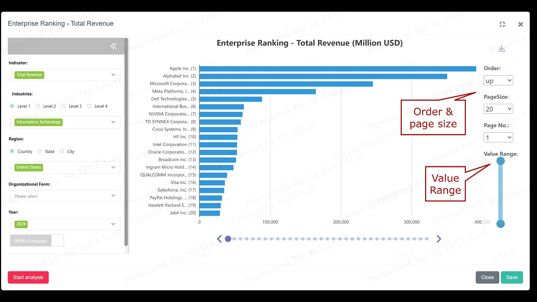
Enterprise Ranking

25
Enterprise ranking: ranks enterprises by a KPI of your choice. You can rank the company in ascending or descending order. You can change page size to decide on how many companies to show on each page. You can also select the value range to rank the enterprises with values in the specific range.
25/39
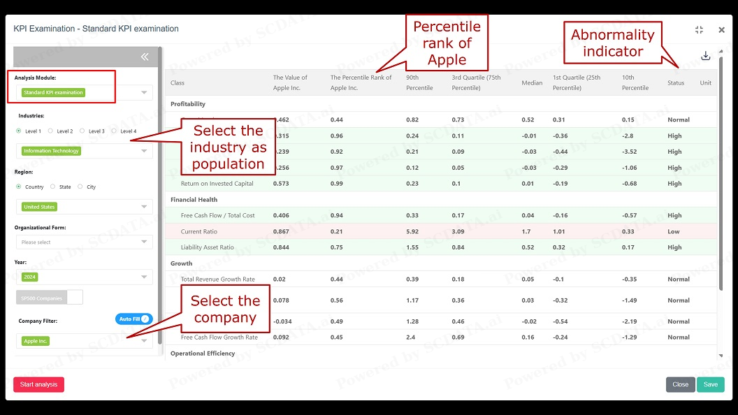
KPI examination

26
KPI examination is the blood work or physical examination report of a company: select an industry as the population and a company so you can compare the company to the population to see where it stands in terms of percentile rank. KPI examination also displays the abnormality indicators such as normal, high or low on the far right column. Analysis module include: standard examination, specialized examinations or customized examination.
26/39
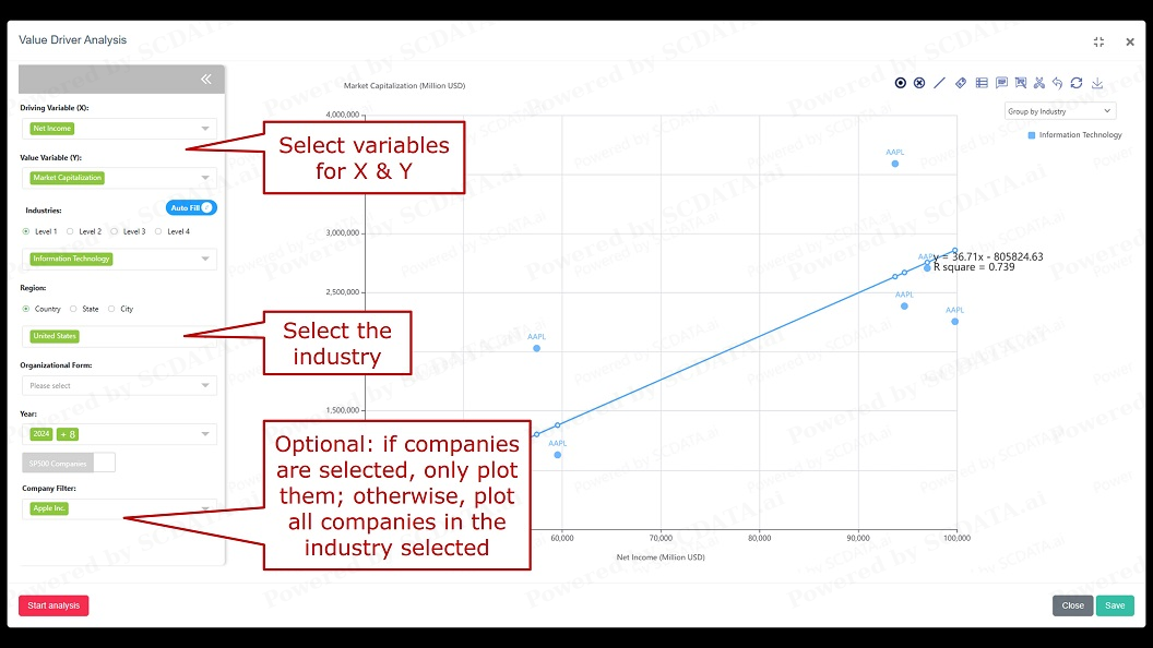
Value Driver Analysis

27
Value driver analysis: allows us to find the causal relationship between two KPIs for specific companies or industry.
On the left panel: please select variables for X and Y by searching or browsing. Then select the industry. Company selection is optional: if selected, the system only plots them. Otherwise, the system plots all companies in the selected industry.
Right panel: same as other scatter plots.
27/39
GCPS Navigator

28
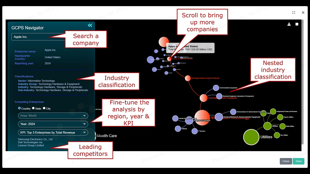
GCPS Navigator is designed to help you find the industry classification and competitors for a company. You can start by searching for a company, by name or ticker symbol, once found, the company’s industry classification is displayed here. You can fine tune the analysis by region, year and KPI. The largest 3 competitors are shown here. On the right, you can zoom in to see the structure of the nested industry classification, and scroll on the sub-industry to bring up more companies.
28/39
Supply Chain Mapping

29
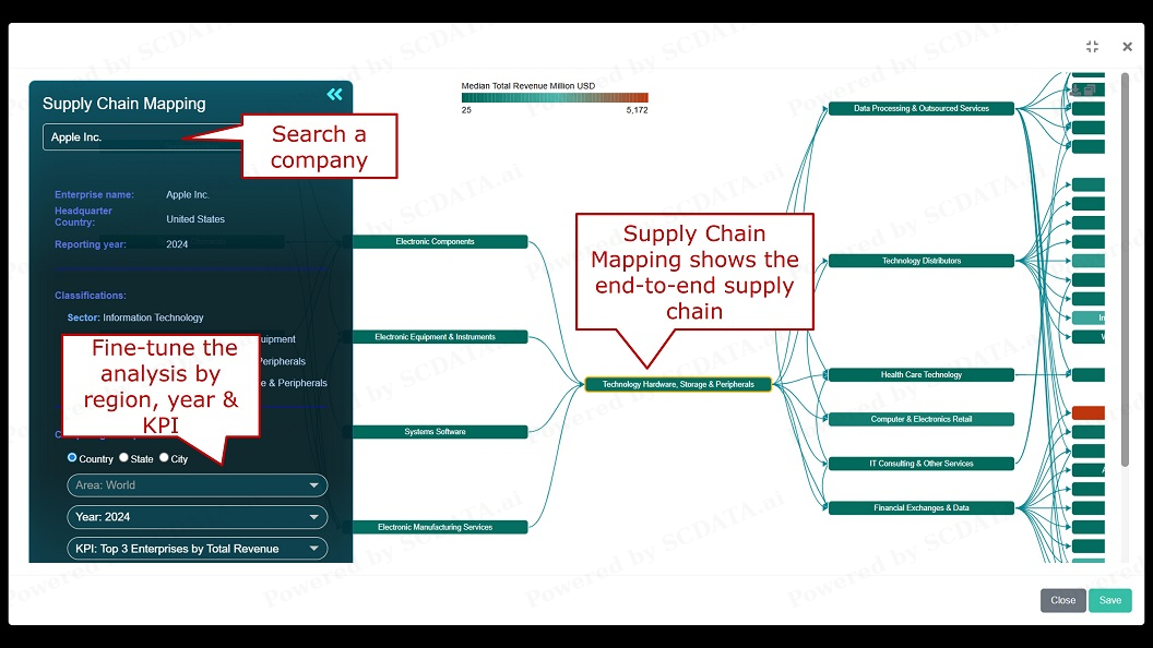
SC mapping: maps out a company’s upstream and downstream industries in the supply chain to identify its potential suppliers and customers. We start by searching a company, say Apple. Apple is classified as technology hardware. On the right, you can see its up or down stream industries. You can fine tune the analysis by region, year and KPI.
29/39
Open node details to show enterprises

30
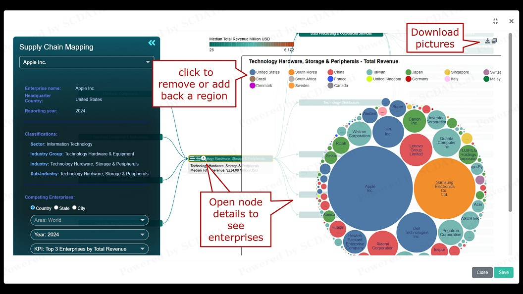
Click on the plus sign of the node (that is, the industry) to open details, so you can see all companies in this industry. Click on the regions to remove or restore companies of these regions. You can also download the pictures, and save the analysis.
30/39
Collaboration

31
You can invite other users to collaborate on a project, by adding, searching and inviting them. You can also cancel the collaboration if deem necessary.
31/39
Collaboration: accept / deny

32
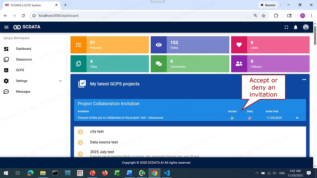
Upon receiving the invitation, the invited collaborator can choose to reject or accept the invitation. If you accept the invitation, you can withdraw later by clicking on the collaborate button of that project and delete yourself.
32/39
Collaboration: work on a collaborative project

33
Multiple users can work on a collaborative project. If one user is working on a page, other users cannot work on the same page simultaneously but can watch. Edits saved are instantly made available for all users.
33/39
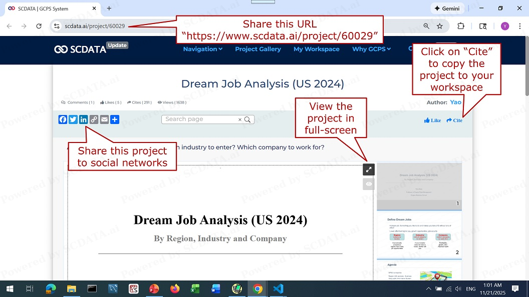
Slide-show

34
You can slide-show the project interactively to your audience. The interactive charts with live data can help you handle what if questions. You can make your presentation in full-screen. If you like to share the project, please use the URL above. You can also share your project to social networks. You can copy any project publicly available on this site to your own workspace by click on this “cite” button.
34/39
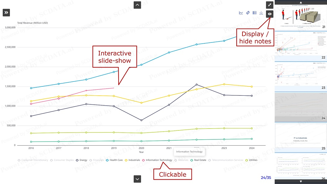
Full screen effect

35
Here is the full screen effect, you can see the interactive slide-show with one line being drawn. The legend buttons are clickable. In addition, you can display or hide your notes on this page.
35/39
Discussion board

36
Each project has a discussion board attached to it. You can join the discussion by asking questions or providing answers and comments. On the right, you can find similar or related projects for further reading.
36/39
Resources

37
Enormous business intelligence & insights were generated on the site by users from all over the world, you are free to search and discover your favorite projects and insights in the project gallery.
37/39
Open user profile
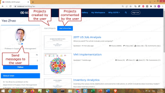
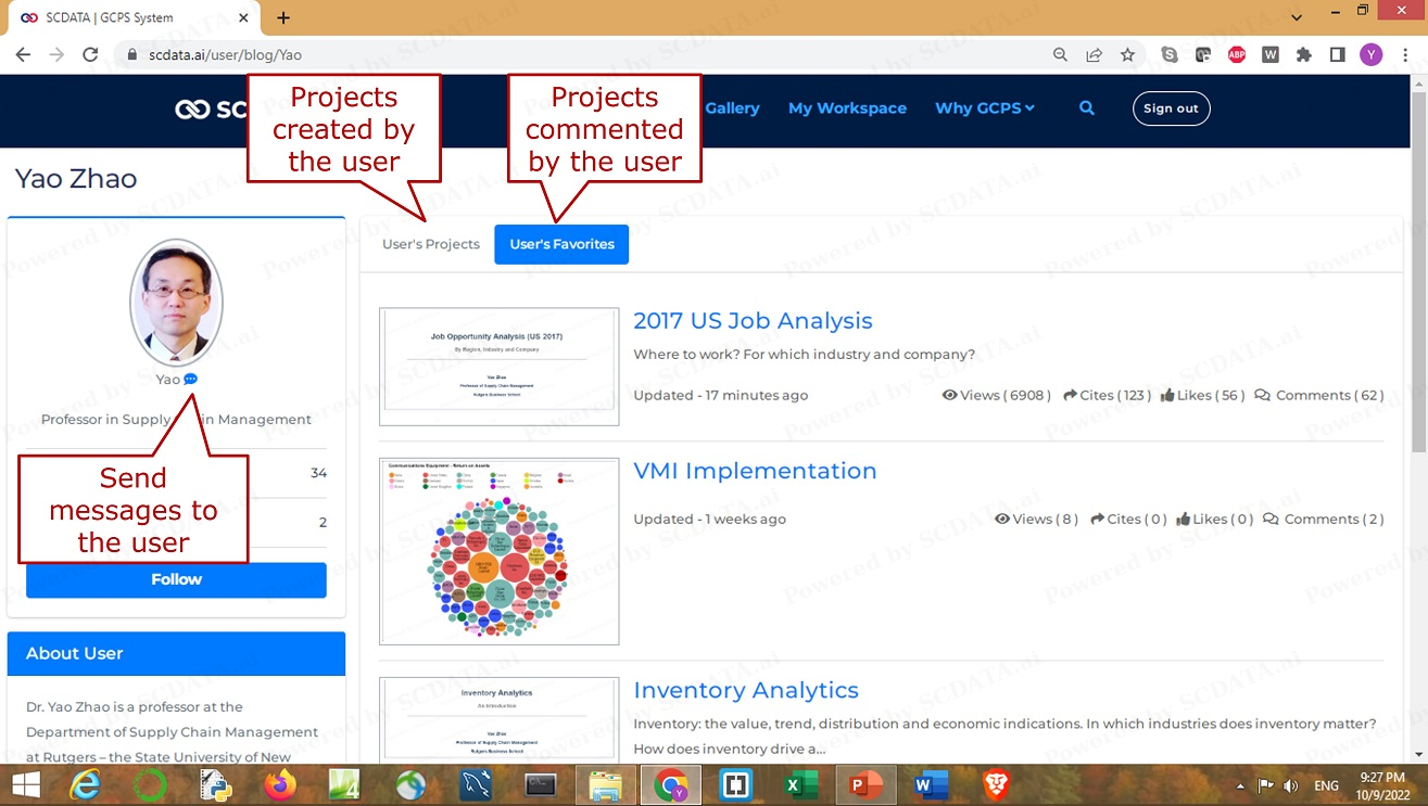
39
Open up a user profile, you can see projects created by this user or commented / viewed by this user. If you have questions, you can send the user messages.
39/39


